Petsmart Pet Portal
Timeline
My Role
Approach
Deliverables
3 week sprint
UX Research (team of 4)
Discover & Synthesis
Ideate
Design
User Testing
Reflections
Competitive Analysis
Business Model
SWOT Analysis
Service Blueprint
Site Map
Storyboard
Tools
Figma, Slack, Trello, Google Suite
Type
Mobile Platform
Overview
Petsmart is introducing a new curbside service to allow pet owners to receive veterinary care for their furry friends without having to enter the store, promoting a safe and convenient experience for everyone involved. The curbside service includes a variety of veterinary services, from routine check-ups to more complex procedures, and can be scheduled in advance to ensure a smooth and efficient process through the Petsmart Portal. Through this mobile app, clients can manage time, place, location, and appointments when they are ready to attend these appointments.
Problem
Solution
Unfortunately due to the pandemic, there are a number of precautions Petsmart needs to abide by to make sure their clients remain safe. They are currently trying their best to manage their curbside service, spread out appointments to meet social distancing, and keep up telehealth appointments.
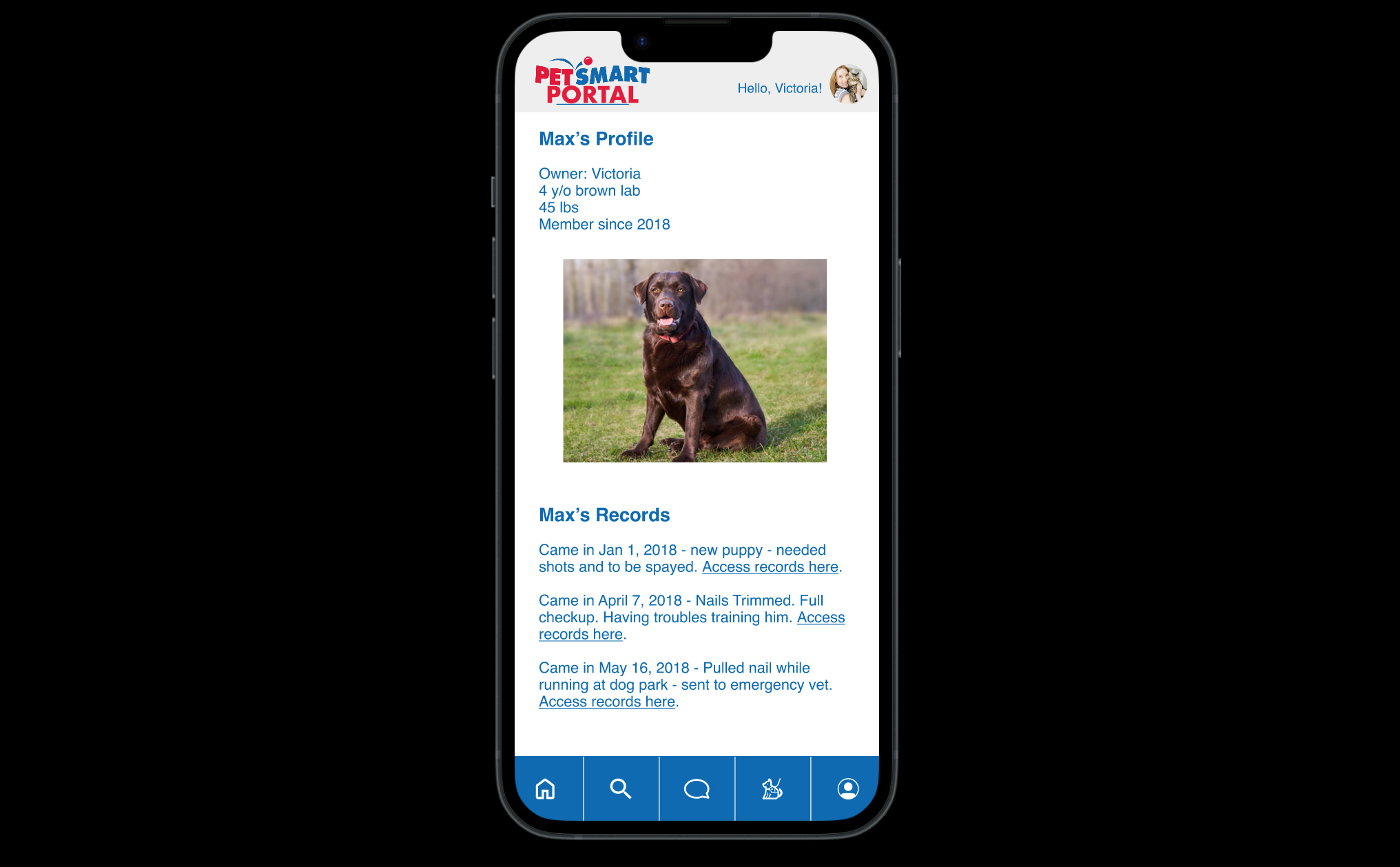
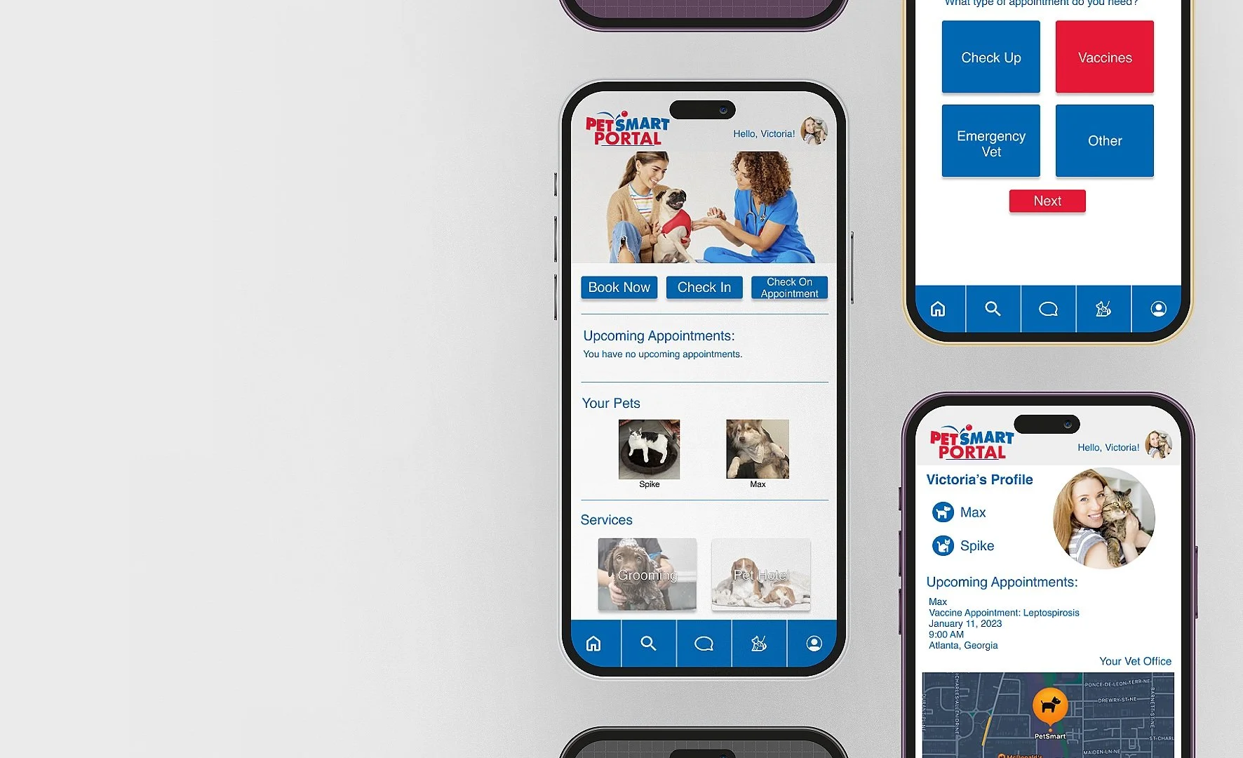
Our group created a Pet Portal for Petsmart’s veterinary clients. Here they can access their pet’s medical records, and appointments, and check in to their appointment upon arrival at the clinic. This platform also allows the pet parents to communicate more efficiently with the providers.
Discover
Competitive and SWOT Analysis
This was the first step to getting everyone in the group on the same page. We discussed team dynamics and assigned everyone a role that they would lead. I was in charge of research. From there we set a scope for our project and a projected timeline.
Business Model
Research & Project Plan
Affinity Mapping
Our main findings included:
People struggled to trust the care for their pets when they couldn’t meet the doctor and see how they interacted with their pets.
Veterinary medical providers struggled to keep up with communication internally and externally throughout the pandemic. Communication took 2x as long.
During the pandemic, appointments were accommodated for 40 min unless they knew for sure it would be faster. Lengthier appointment times cut into fewer appointments being scheduled in a day due to these communication delays.
We wanted to get a general understanding of Petsmart’s business model. We found it focused on offering a wide range of products and services to meet the needs of pet owners while generating revenue through both retail sales and services to enhance customer loyalty.
We wanted to identify Petsmarts competitors, their strengths and weaknesses, and how they operate within the market. We compared them to big-name pet care providers like Petco and Thrive Pet Care. We found only 7 Petsmart locations had a veterinary clinic and they did not offer telehealth appointments. This means their clients do not have access to their pet’s medical records online. Petsmart’s veterinary clinic has opportunities for growth and expansion to help raise its competitive advantage within the veterinary service.
User Interviews
We wanted to learn about what pet owners consider when they are booking and attending their pet’s appointments. We also wanted to hear about their pain points and how their experiences changed since the COVID-19 pandemic. Due to clinics having to abide by regulations and changing the way medical providers provide care to their patients. Finally, we also interviewed Veterinary Providers as they would give us more context as to what goes on in the back end of these appointments and allows us to hear about any possible pain points they experience as well.
To ground our interviews, we asked these questions to the pet owners:
How did you go about deciding what type of appointment your pet needed?
How were you expected to meet social distance requirements?
How did you interact with your pet’s doctors inside and outside the clinic?
We asked these questions to the veterinary medical providers:
How has the pandemic changed how you provide service to clients?
What do you have to account for in the backend operations of the clinic (spacing between appointments, etc) to do this?
Do you provide telehealth appointments? Why or why not?
Synthesis
Persona
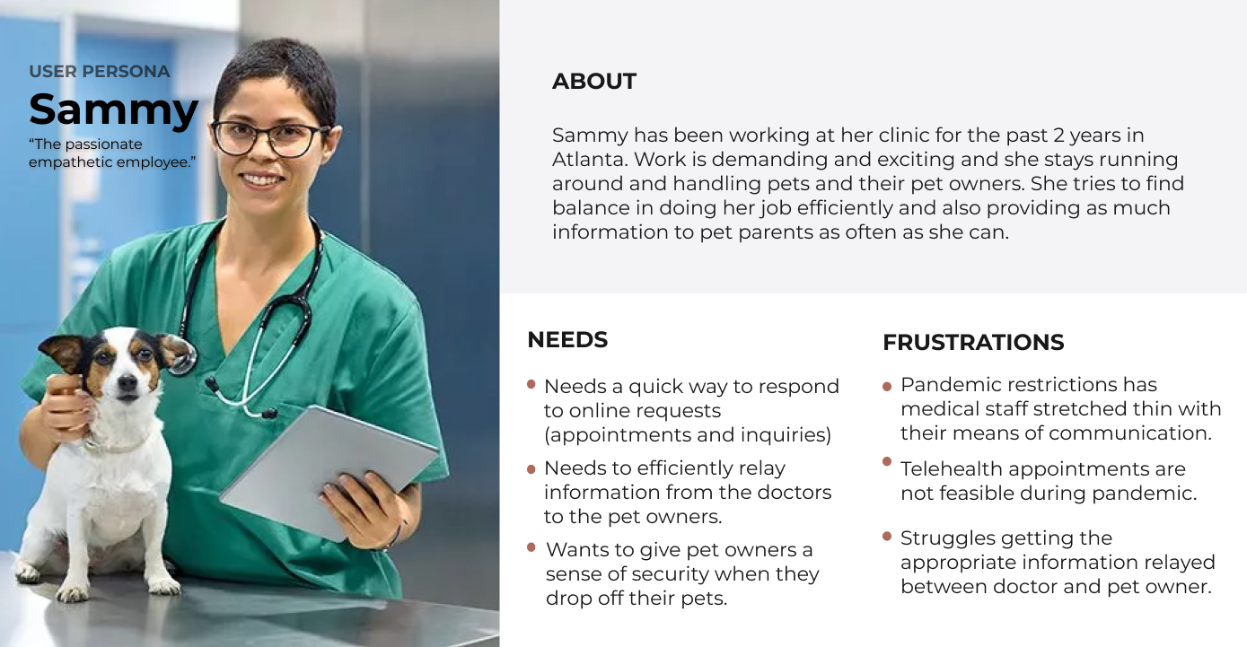
From the patterns we uncovered in our user interviews, we created two user personas which we referred to throughout our whole design process to help us make user-centered decisions.
Problem Statements
Victoria needs an efficient way to schedule appointments and contact the Vet.
Victoria wants a way to keep track of her pet’s medical records without the hassle of trying to get information from the Vet over a phone call due to the pandemic restrictions.
Sammy needs an efficient way to keep track of her patients and keep pet parents updated during the patient’s appointment while dealing with a lack of in-person communication due to the pandemic restrictions.
Victoria and Sammy need an efficient way to connect in case they are not able to physically be present inside the clinic.
“How Might We...” Statements
… create an experience that will help Sammy and Victoria connect efficiently?
… help put users at ease when going to access pet information and records?
… make the appointment scheduling process quick and feasible?
… help Victoria feel safe and comfortable with the information she is receiving from the vet?
… help Victoria feel involved during her pets appointment without her physically being in the room?
… make the pet record updating process quick and seamless?
With this information, we were able to identify pain points that our users experienced.
With the insights we uncovered, we constructed How Might We statements to redefine the problem and frame the problems for ideation.
Storyboard
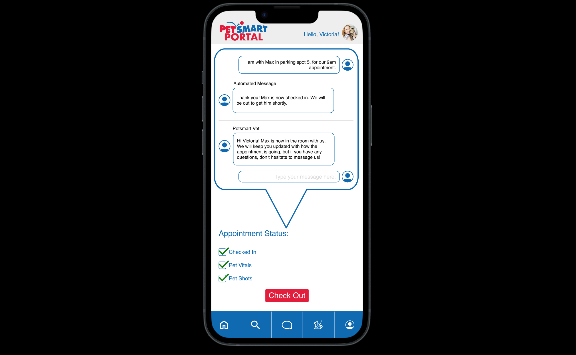
Our storyboard demonstrates how our users interact with the application we are building. It highlights how even when Victoria cannot be physically in the room with the provider, she can still receive live updates. She also has the control to access her medical records, pet profile, and check-in for appointments after booking.
Site Map
We thought about the functionality of the app and the information that would be added. We mapped the information onto a site map which allowed us to see at a high level the information and flow we envisioned for this product.
User Flow
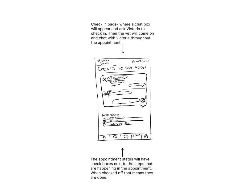
We thought about the motivations and needs the user would have throughout the site experience. This user flow showcases the process for booking an appointment and checking in for that appointment.
Ideate
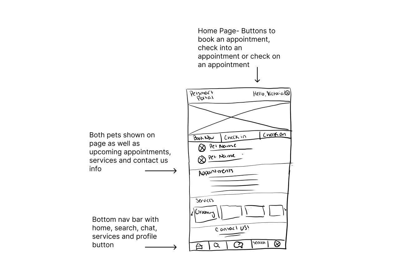
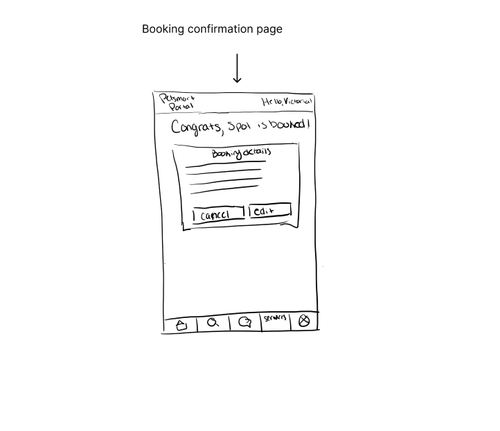
Our research gave us enough insights to begin thinking of possible solutions to our user’s pain points. Our teammate Abby, sketched out various ideas to lay out all ways to tackle the problem and uncover the optimal design path.
Sketches
Design
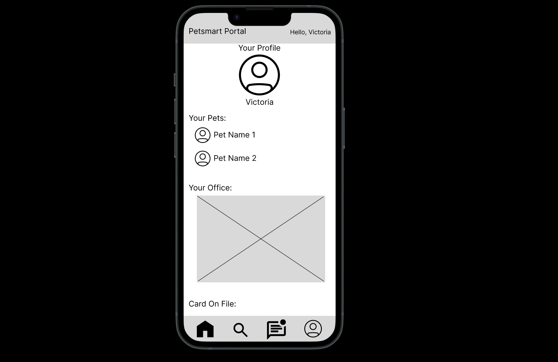
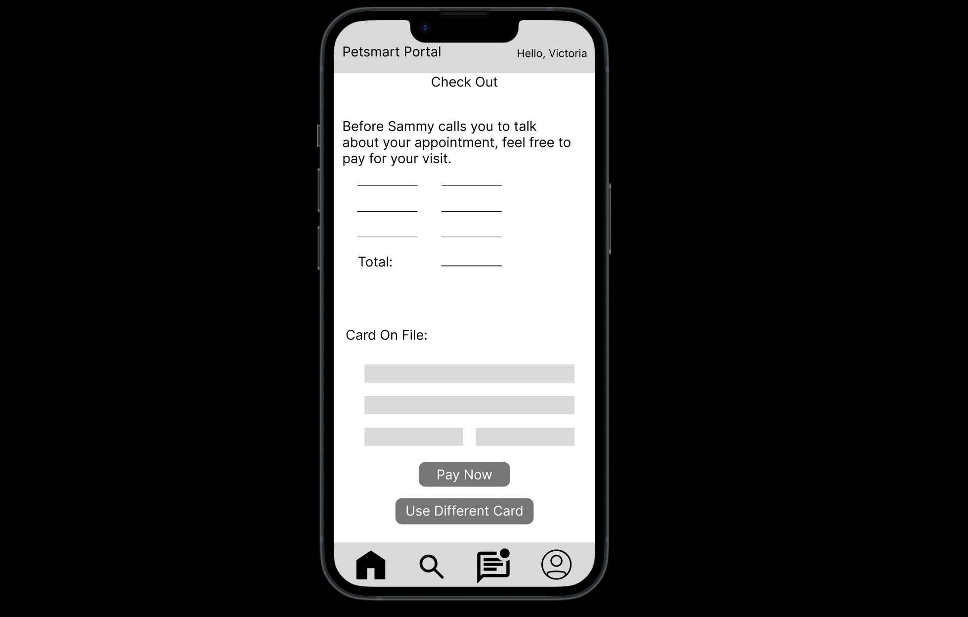
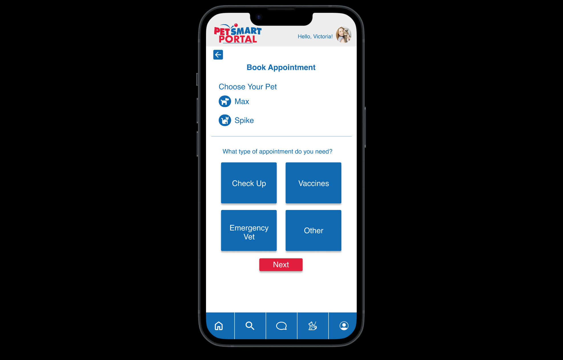
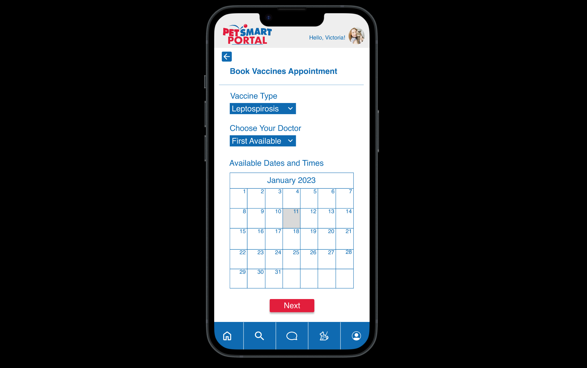
Our mid-fi design encompassed all the research information and user-centered design approaches we discovered.
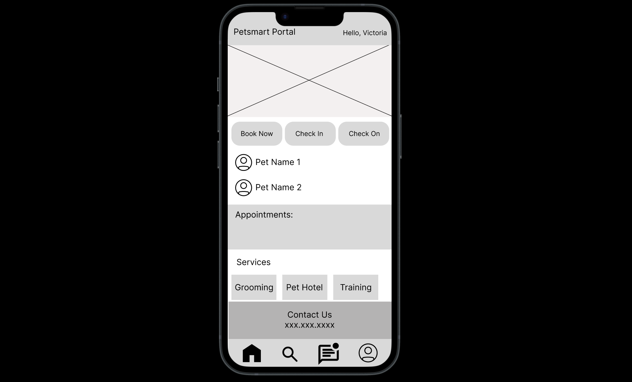
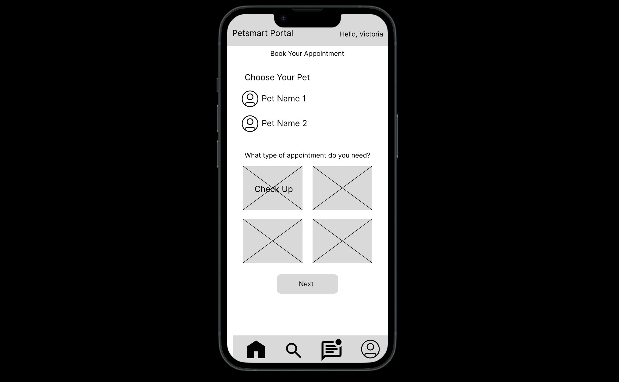
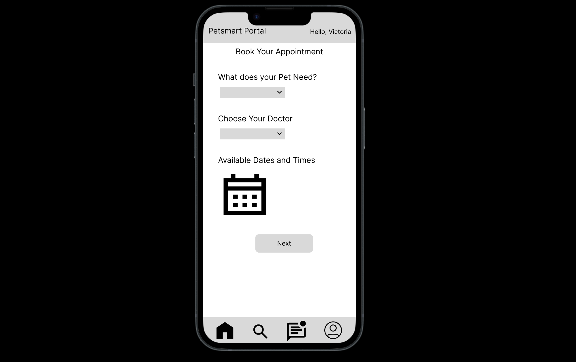
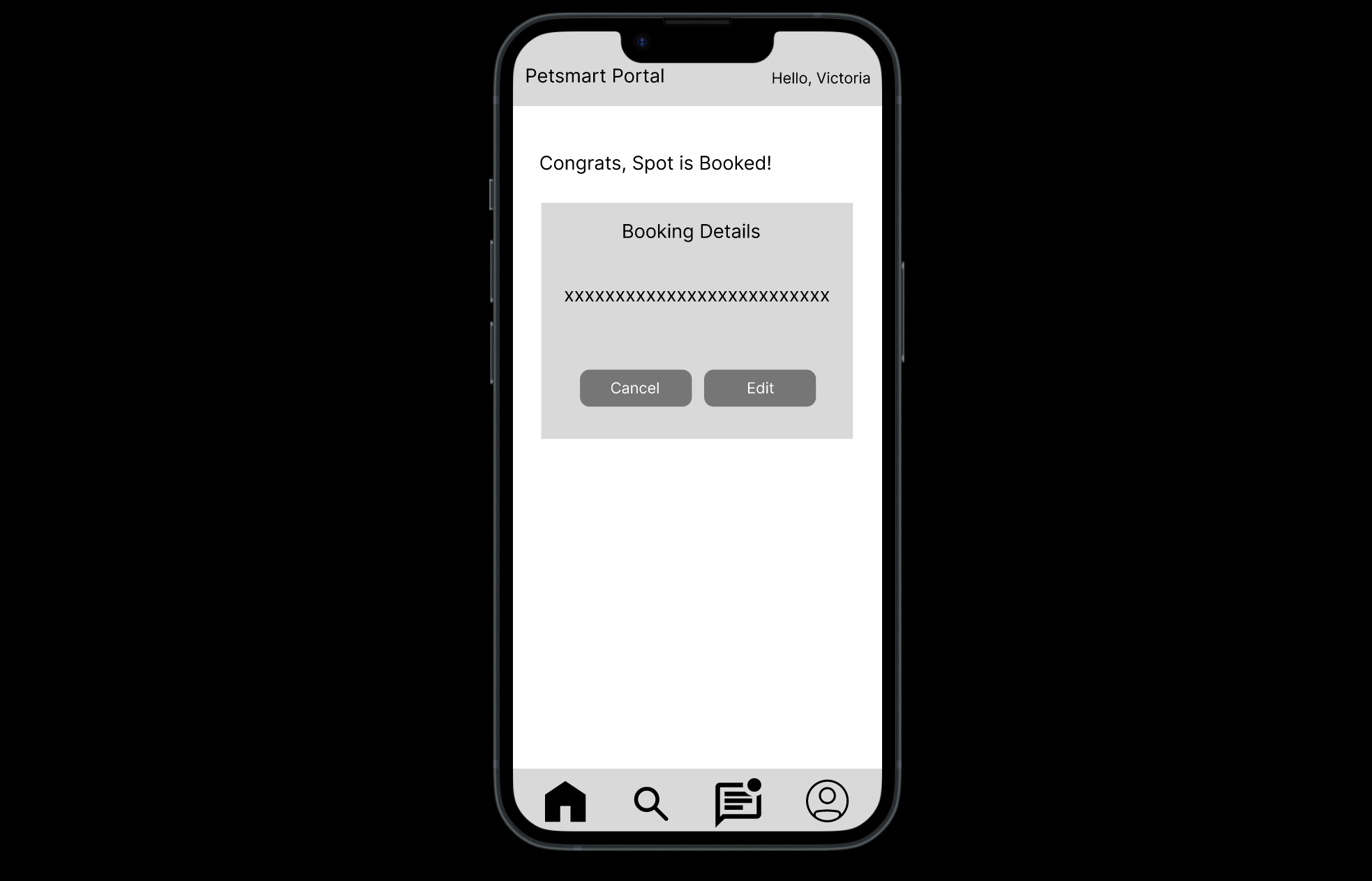
Wireframes
We brought our designs to begin prototyping. This way we can see where there may be inconsistencies in our design. We thought about it from the user’s perspective. From there we brought that into our user testing.
User Testing
Prototype
We found that there were hesitations from users when clicking on items that did not have an interaction associated with them.
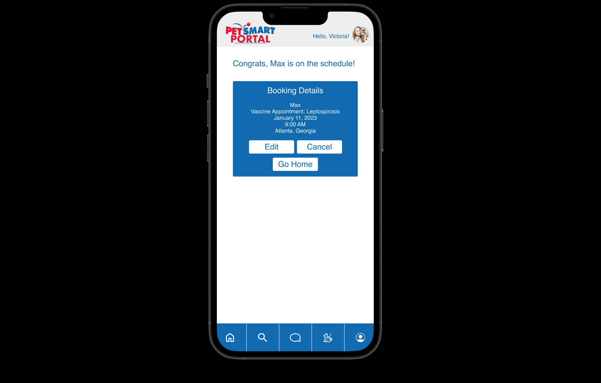
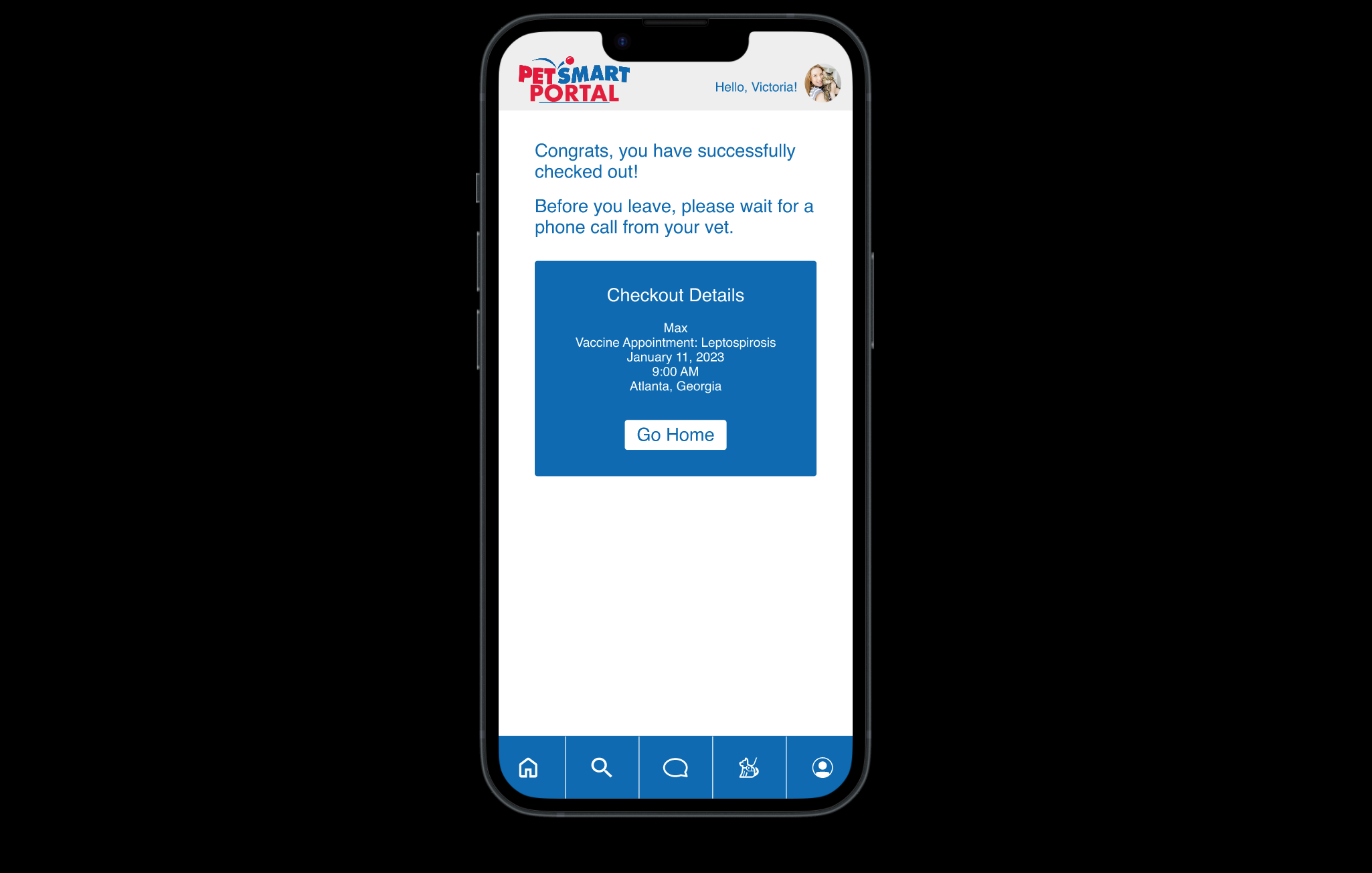
Our users seemed to look for an exit button after their booking confirmation page popped up.
User Testing
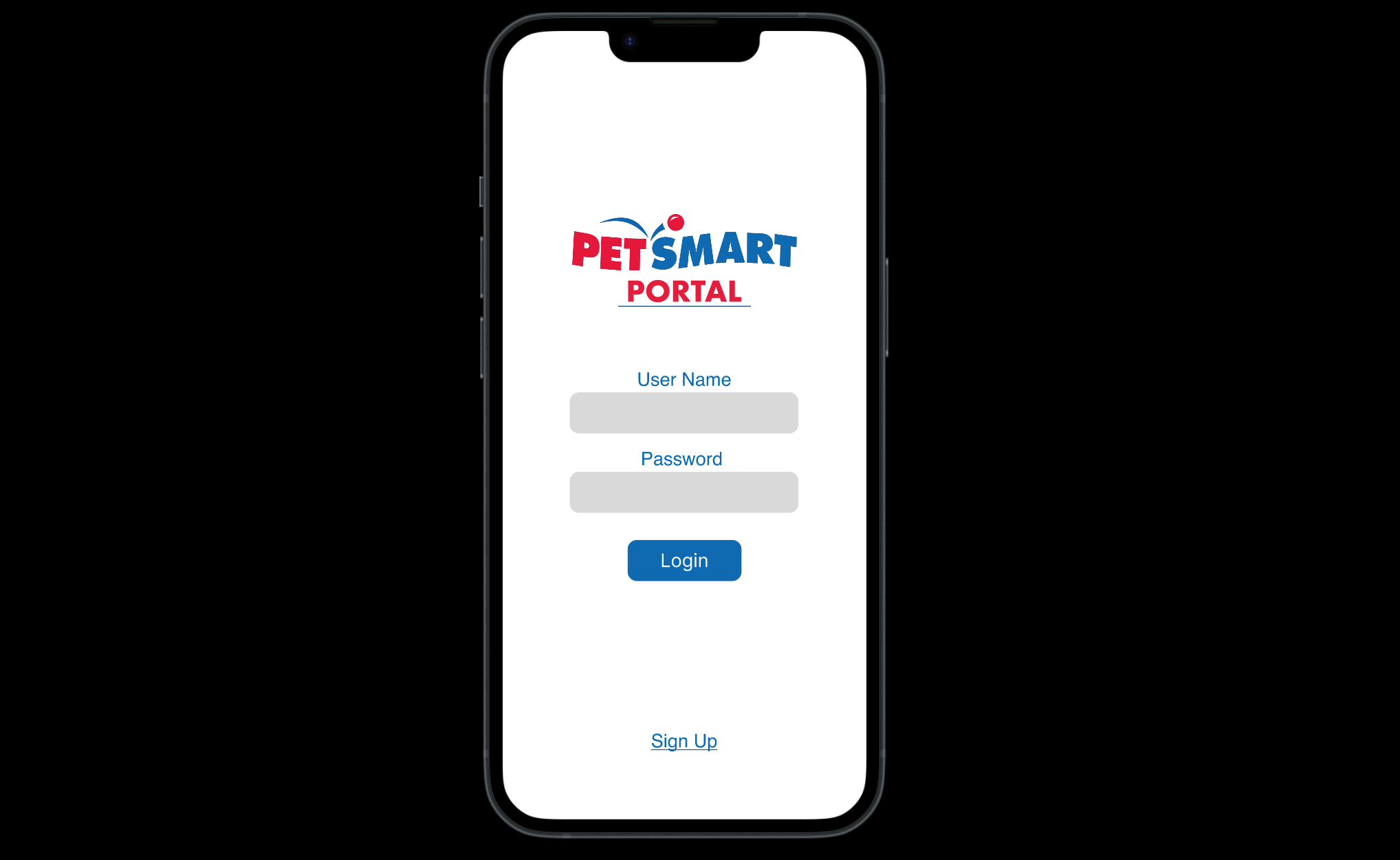
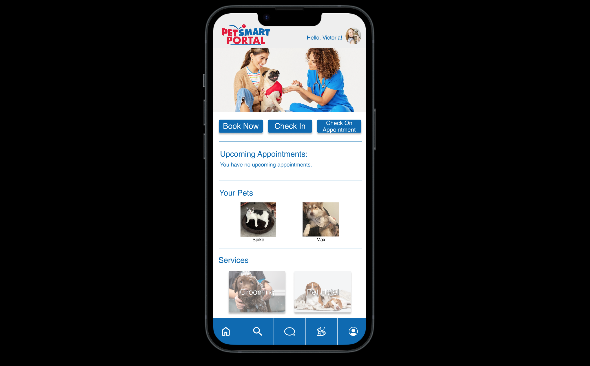
High-Fidelity
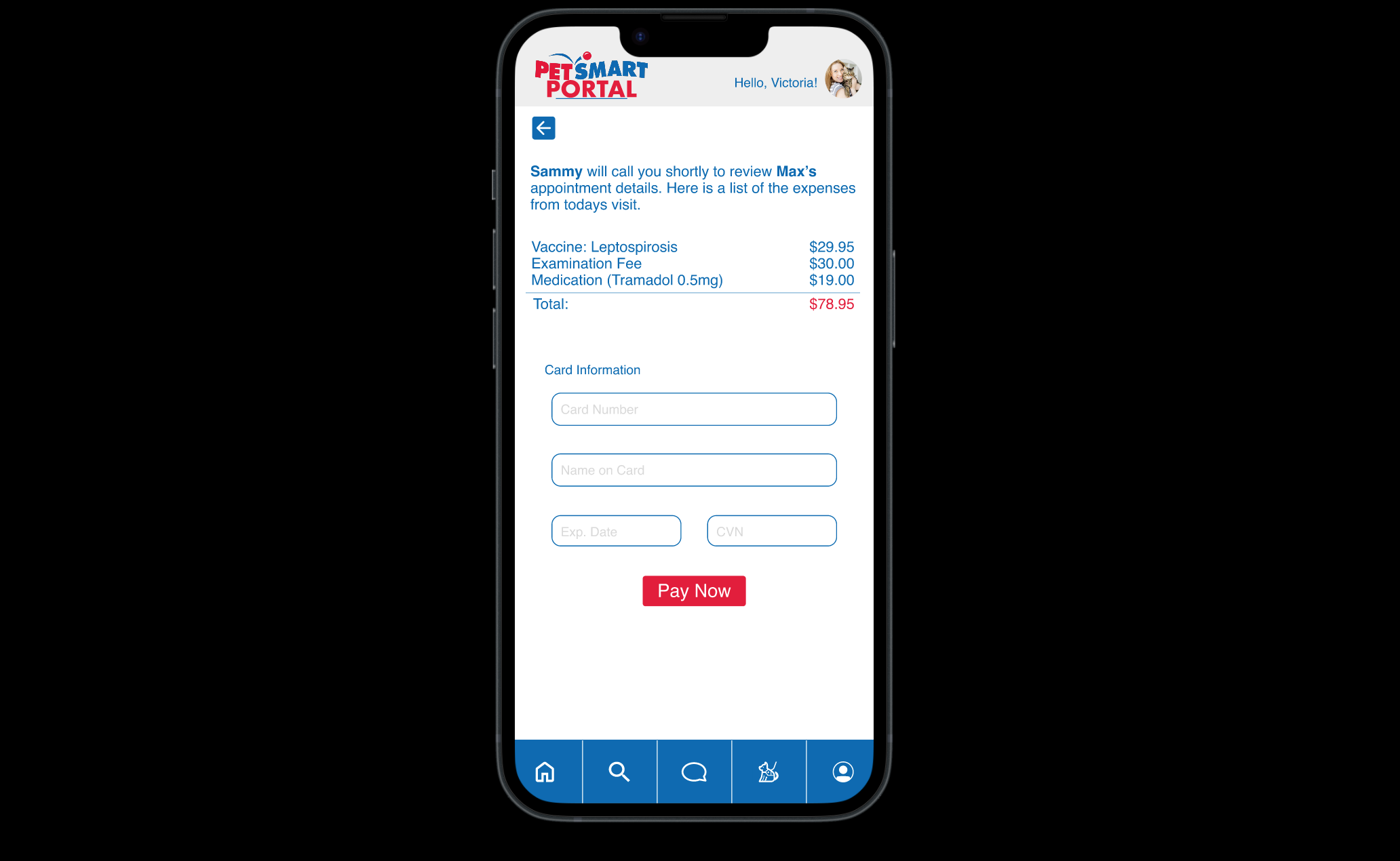
With this redesign after usability testing, we were able to resolve issues that our users had hesitations with. We differentiated how our buttons were presented so as to not confuse users to click on the wrong item.
Reflection
Moving Forward: We want to further improve UI elements to improve accessibility. We would also like to re-consider appointment scheduling on the client and provider’s side so emergency and non-emergency situations.


