Hayward Flowers
E-commerce Website Redesign
Timeline
My Role
Approach
Deliverables
Competitive Analysis
Heuristic Analysis
Affinity Mapping
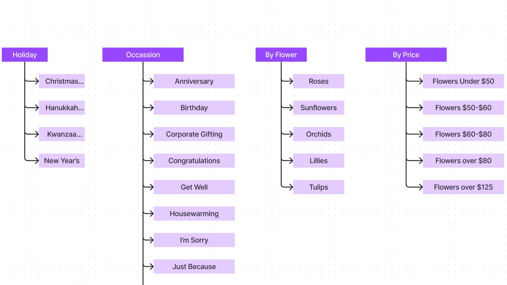
Site Mapping
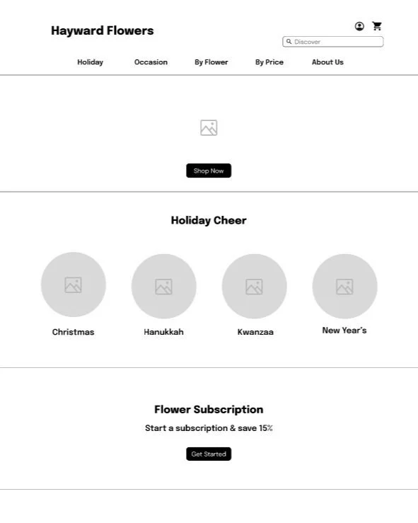
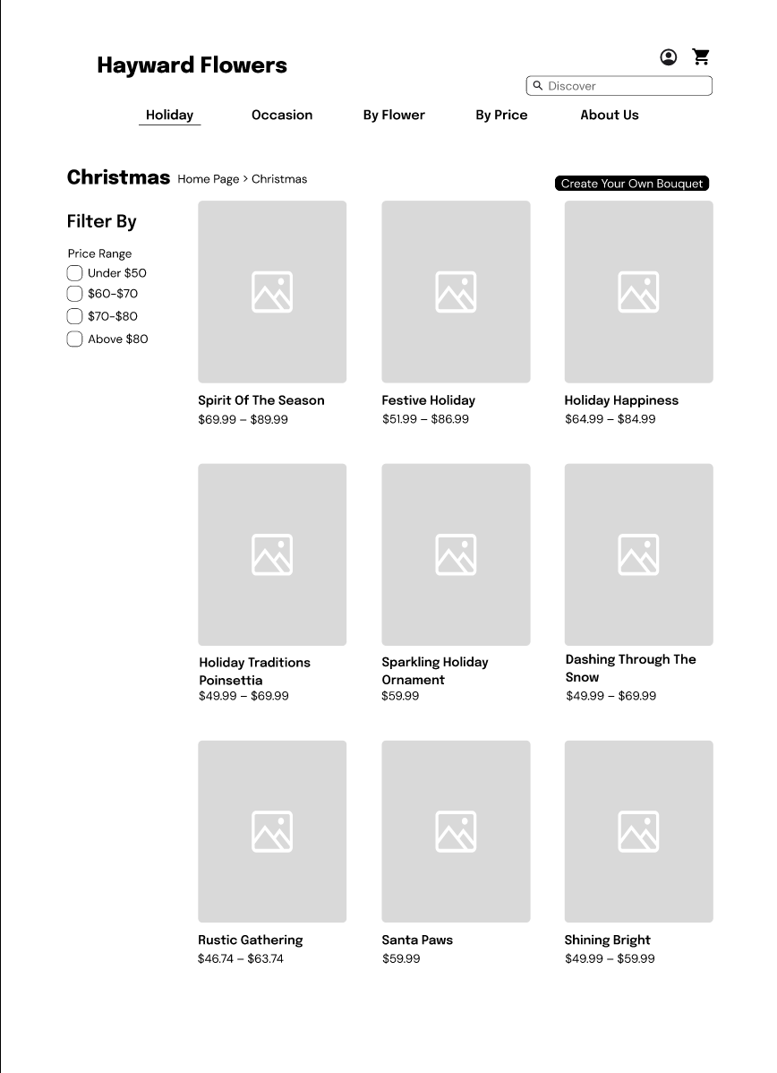
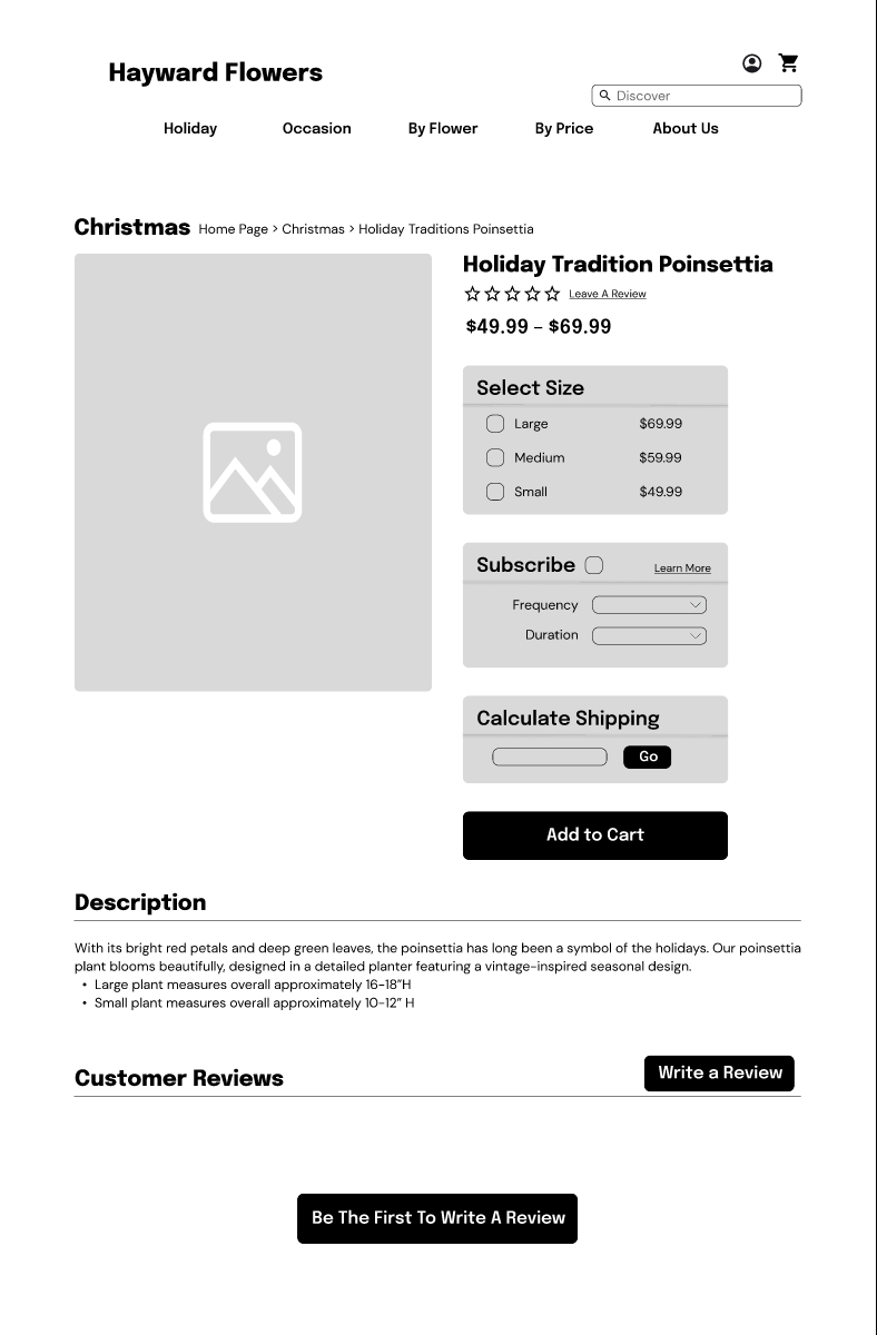
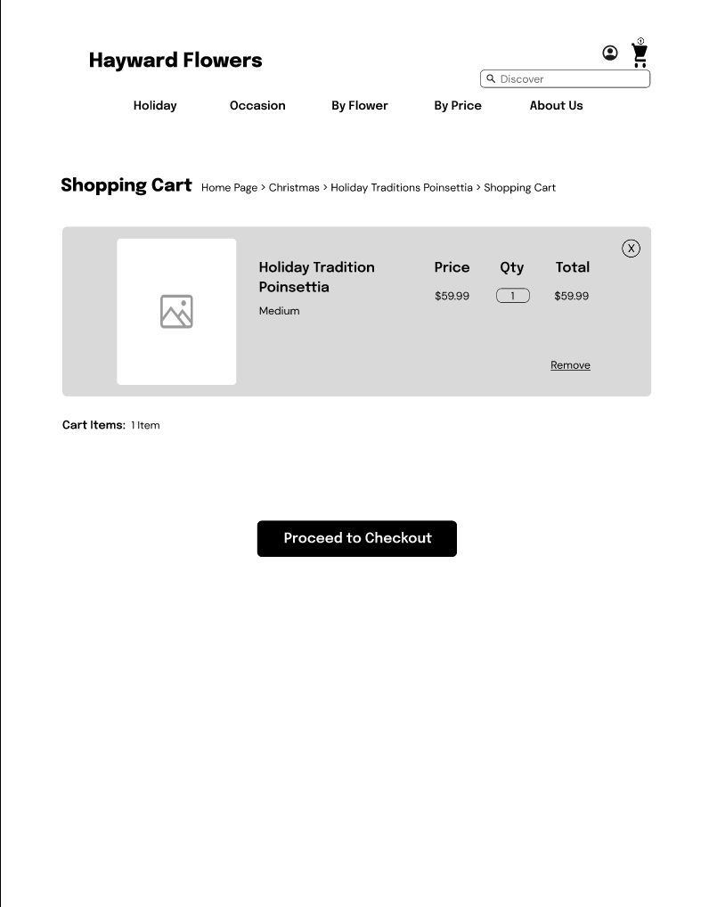
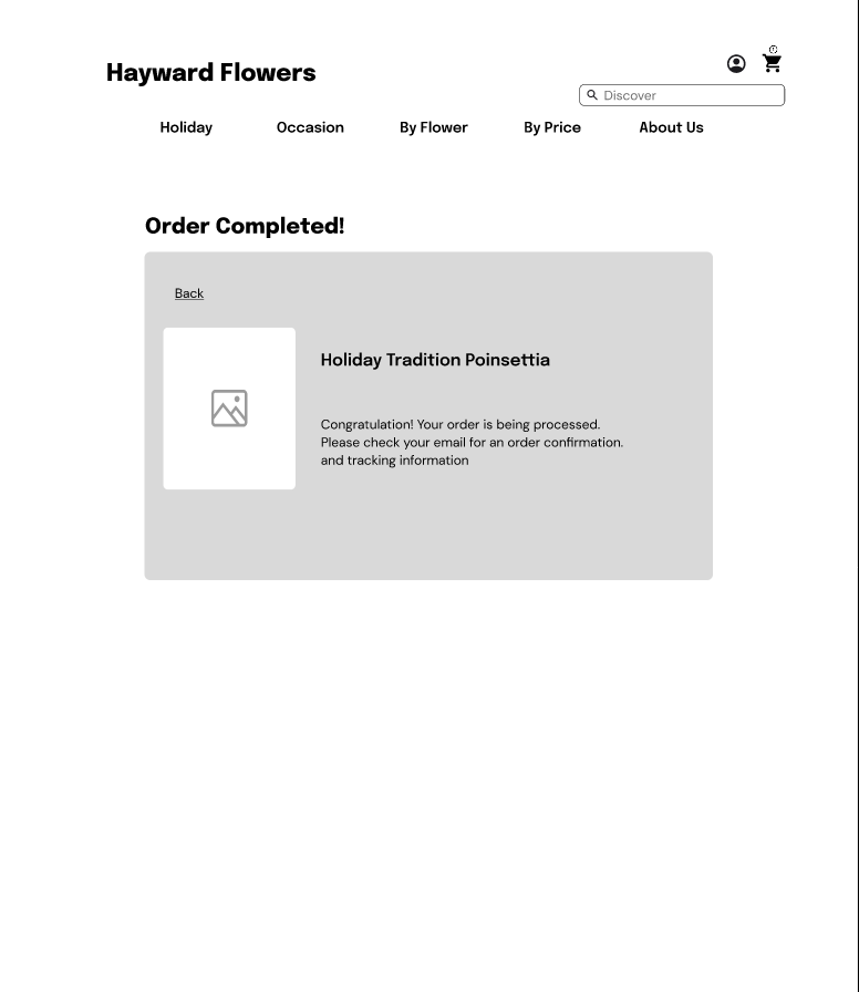
Wireframing
Usability Tests
Discover & Synthesize
Ideate
Design
User Testing
Reflections
Sole researcher & designer.
Two week sprint
Tools
Type
Figma and Google Suite
Website
Overview
Hayward Flowers, a local flower shop in Hayward, CA, has been in business for several years, offering a wide selection of flowers and arrangements for various occasions. Despite its reputation for quality products and exceptional customer service, the shop's current website lacks a modern and user-friendly design, making it difficult for customers to find the information they need and complete purchases quickly.
Objective
The objective of this project is to improve the user experience of the flower shop's website and increase online sales. This will be achieved through a comprehensive redesign of the website's user interface to create an attractive, intuitive, and functional website.
Solution
The first step in improving the UX of the flower shop's website was to conduct a thorough analysis of the existing site as well as conduct user testing to gather feedback from potential customers. Based on the results of this analysis, a list of recommendations was developed to improve the website's UI and UX.
Discover
My process began with interviewing people who have purchased flowers and trying to understand their thought processes while shopping for flowers. I annotated their responses and sorted them to find any patterns. Below are the main findings from those interviews.
Findings:
People express how they are in a rush when purchasing flowers because it is usually a last-minute gift that they are trying to gift. This means the interaction must include zero errors before they resort to the next possible solution.
They prefer shopping in a grocery store due to the freedom to create their own bouquet in case they don’t like the pre-made ones.
User Interviews
Competitive Analysis
This technique was used to highlight features that competitors within the market used to leverage their companies.
Competitors had more than 9+ categories but also included subcategories below that.
Other competitors had options that were under $50 making it easier for those that were not big spenders.
Big-name competitors had a subscription service. This can help build loyalty between customers and the flower shops as it engages customers by offering them incentives to be active customers.
Allowed me to see how users interacted with the website. It allowed me to observe their hesitations and obstacles.
I found that 60% of my users could not complete their purchases.
Users didn’t know what flowers were included in their bouquets because of the lack of descriptors on the website.
Heuristic Analysis
Aesthetic and minimalist design violation
Users missed valuable information in this paragraph due to the design/format of this information.
Recognition rather than recall violation
The user’s memory load is pushed in guessing the name of the flowers in their bouquet as the current site does not have descriptors of the flower bouquet.
Match between systems of the real world violation
Search results should match inventory in a clear natural order. This system does not as it only yields two relevant results when the inventory covers four different categories in the same sector.
Help users recognize, diagnose and recover from errors Violation
There are no indicators on the site that show which items are/are not available. This pop-up only shows up after a customer has decided to complete their purchase. Frustrating the customer after they see they can’t order it.
Retrospective Journey Map
Based on the usability tests that were conducted this journey map indicates how the experience is for Jaime. In order to improve her experience and help the business retain customers, the interaction design must be redesigned. Below were my findings and recommendations.
Persona
Jaime is looking for flower shops that can deliver to her best friend in her hometown. She wants to purchase her friend a birthday gift in the month of December and is looking for a local flower shop to purchase from to support her local community.
Synthesize
Site Map
Based on the usability tests that were conducted this journey map indicates how the experience is for Jaime. In order to improve her experience and help the business retain customers, the interaction design must be redesigned. Below were my findings and recommendations.
Findings/Recommendations
-

Home Page
The focal image and header were too big and were not responsive to screen size.
-

Reccommendation
The header is extended to the full page and the focal image is not used as a distraction.
-

Home Page
The home page included a large body of text on the home page that made it hard for users to read through.
-

Recommendation
The redesign separates all that text from the home page and creates its own page to highlight all the information being conveyed.
-

Search Bar
The Search Bar on the website did not offer matching results.
-

Recommendation
The detailed result presents the most relevant information, which generally matches all form inputs but in some cases incorporates even more product details from the product pages.
-

Availability
Users had to go through the entire checkout process before getting notified that their bouquet was unavailable.
-

Recommendation
Recommended to update users with live availability updates and gives users the chance to build their own bouquets in case they didn’t love their options.
Mid-Fidelity Wireframe
High Fidelity Prototype
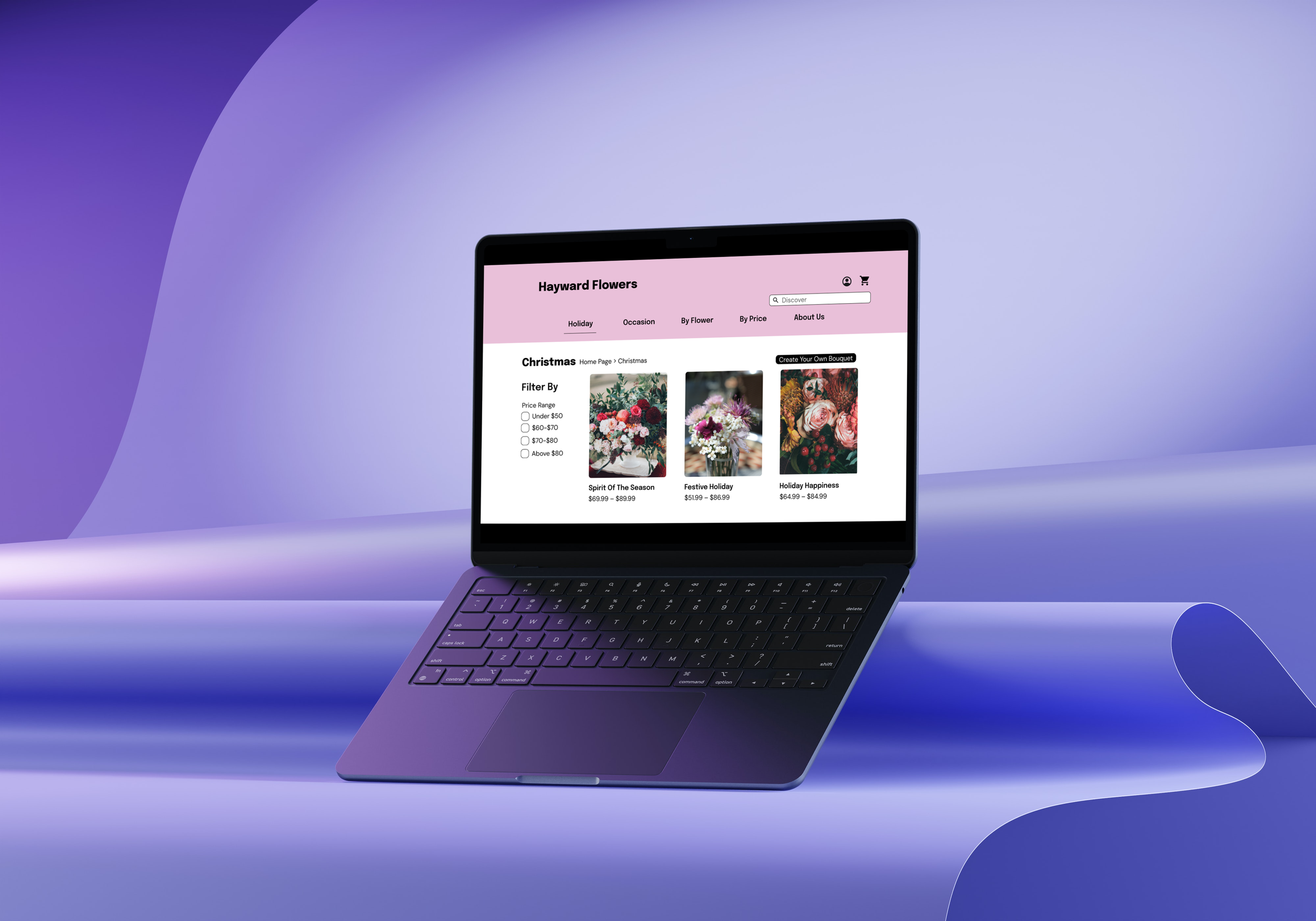
App Usability Testing helped me pinpoint any features that still needed to be improved upon. For example, the “Create Your Own Bouquet” button was not shown enough to catch the user’s attention. Below is the final iteration of Hayward Flowers thus far.
Next Steps
This website went through changes to improve its interaction design. Moving forward, I would like to focus on fleshing out the “Create your own bouquet” feature more. This would get more customers more comfortable with the idea of playing around on the site and creating something unique for them.
I would also like to build on the Subscription model for Hayward Flowers.


